Several months ago, in order to prepare for some home improvement work, I scoured the appliance and supply websites. The goal (ahah!) was to get an idea of the costs, to estimate the budget needed. What could be better than to put all the items in my basket, no need for a calculator! Reassure me, I'm not the only one who does this isn't it?
A few days after my "shopping", I received the email below from But (and it's the only company that sent me one, but to be honest I don't know if I was logged into my customer area on the other sites or not).
To prepare this article, I obviously went back to the site, and surprise: as for the promise to "keep my basket warm", after almost 6 months it's still the case! Some items are no longer available, but they are all still in my shopping bag to this day.
More! I received an abandoned cart email again, and it has moved on. This analysis will therefore be twofold. I hope you are greedy, because it promises to be long ^^.
The sender of the email
The 2 emails received were routed from the Acoustic platform (presumably).
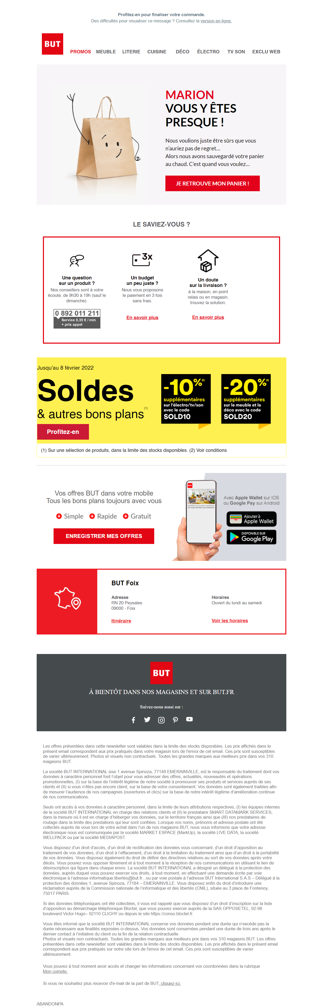
January email
Sender: Goal info@news3.but-news.fr
Subject: Marion, your basket is warm!
Preheader: Take this opportunity to finalize your order.
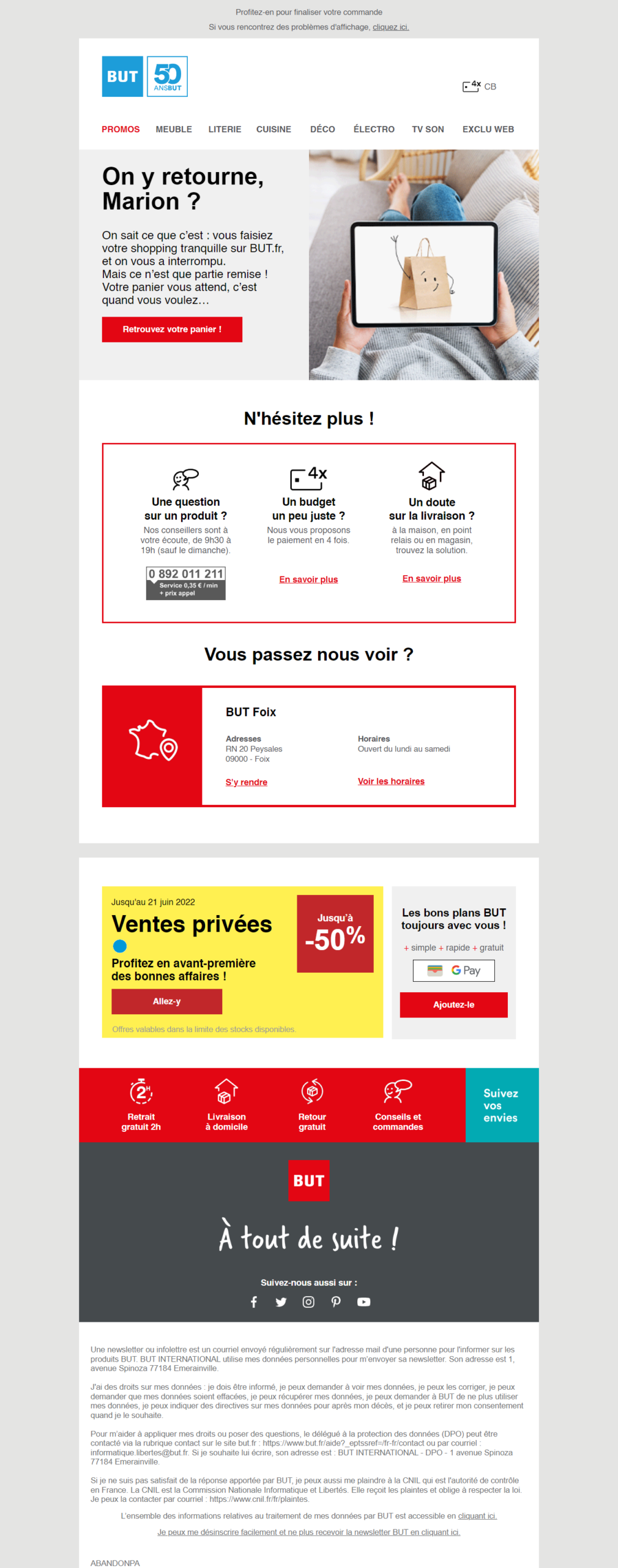
June email
Sender: But store info@news3.but-news.fr
Subject: Marion, your basket is warm!
Preheader: Take this opportunity to finalize your order.
Design and content analysis
Respect of the charter
The colors of the charter seem to be respected, on the other hand on the V1 we have 4 different fonts in the email : CircularStdBold for the menu and most of the texts (not interpreted on my computer), Lato in the main block, Arial on the mobile application block and the MLs, and finally Times New Roman on the footer... A bit much. So I guess there is no Design System or at least that the emailing part must be missing.
For V2, it's better! The main font is CircularStdBoldThe order of the replacement fonts is not the same on all the blocks, so I have Arial and Helvetica (we agree, who makes the difference?).
The new version has a small plus: the body is now on a grey background, which helps to structure the whole email.
The header and intro
The logo, although small on the 2 versions, is very identifiable. Its size also allows enough space to display the menu without it being too narrow on the V1. We note the change of color for the 50 years of the brand in the V2, which is currently on the site.
Considering the type of shipment, I would have appreciated to be able to access my customer area in the header, although the main block allows to go quickly to the shopping cart. So the main objective was largely fulfilled.
Small addition on the V2: a picto that highlights the payment in 4X, which can remove a brake to the purchase. Good idea.
The visual of the paper bag is an animated gif (it makes peek-a-boo), and it is very cute ^^. As in the object, the main title is personalized with my first name which is often appreciated by the readers. Major difference between the 2 emails: the text. In both cases, I find it very well delivered and engaging, we clearly understand what content we are dealing with.
Secondary blocks
Let's take a look at the secondary blocks. To begin with Did you know that? (V1) : there is a display problem here. The columns are not treated optimally in the code, and are completely closed on the left (the margins are coded with <td> instead of margins). The new version displays perfectly, and the column titles are more readable.
As far as the content of this block is concerned, I must admit that I'm dubious about the pay phone line, but to each his own strategy and business model after all. On the other hand, I would have liked to have the possibility to contact the customer service via other means like a chat, a form, or by email. However, if we refocus on the main purpose of this email, the payment in several times and the reassurance on the delivery are indeed well thought.
Note, on the mobile version of the June email, the left column with the phone number is hidden, which allows not to have an email too long in responsive.
We then have a promotional block (sales and private sales), whose display was clearly not the best at the beginning of the year with elements without margin on the left, and which is now optimized. However, I have a reservation on the current version about the legal notice, written in gray on a yellow background, not very readable, really not optimized from an accessibility point of view.
The good deals block has also been redesigned. We go from a block taking all the width with several texts displayed in images (which has the effect of being slightly blurred, byebye Retina), to a block where all the texts are coded in HTML (we prefer that!), and which adapt perfectly in mobile version. A redesign that it is successful.
We come to one of the blocks that I find most annoying, not so much because of its rendering but rather because of its content: the location of the blind ! I like to say where I live because it often generates questions the first time: Montreal. And you can imagine, not the one you think of at first, no, in Montreal in the Aude (a few km from Carcassonne for the curious).
So, when But suggests that I go to Foix to visit the nearest store, when in reality: 1. it's an hour and a half away; 2. there is a store in Carcassonne, 10 minutes from my home; 3. I chose the store in my customer area as the reference store, it's a bit strong. At the same time, the city of Foix is very pretty, let's say it... But the error is true (and the opening hours are missing).
To finish on the content, here comes the footer. Rather short on V1 (except for the long legal mentions), it has been largely redesigned on the new version, with the addition of a reassurance banner, but some elements are a bit low for my taste. Withdrawal in 2 hours and free returns would deserve to be better exploited in my opinion. For example, I would have liked to see a block regrouping these two points with the payment in several times higher in the email, and another one for the means to contact the customer service in the footer.
The internal nomenclature of the scenario is displayed at the end of the legal notice. A line that is of no interest to customers, which it would be wiser to hide.
To finish on this part, a little misunderstanding on the blue square Follow your desiresThe redesign had started so well.
Code analysis
January email (the old version)
The HTML code is 1654 lines long and 198kb in size. Bad news, the email will be truncated on Gmail (which only displays the first 102 kb). It's heavy for an email of this size.
Very surprising, and never seen before in our code analysis: there is 8 in the email ! Eight declarative ones, each with the tag and its CSS. The are inserted as you go along in the code, as almost every block has its own . Assumption: the email was coded via a builder, which adds this code to each block.
There is lots and lots of useless code in this email: too much wrapping, Outlook specific code that serves no purpose, duplicate CSS due to the many declarations. We can also see some renderings of parts that are not well managed in terms of centering or spacing.
The rest is pretty good but the email needs to be slimmed down. By rewriting the code, it is possible to divide its weight by 3 without any problem.
June email (the new version)
The HTML code is this time 1472 lines of code for a weight of 165kb. A bit lighter but still not enough to be displayed in its entirety on Gmail.
We notice that a big redesign work has been done on this email, but the same problems as on V1 are present, with 6 and duplicate code in particular.
Our recommendations to improve the code
As a priority for lighten the code :
- Gather all CSS under a single at the beginning of the email.
- Lighten the encapsulations that are of no interest.
- Remove all <div> useless.
For improve rendering and accessibility :
- Fill in the 'alt'.
- Use prioritization code: <h1> <h2> <p>.
- Hide the code 'abandon cart' in the legal notice.
Eventually... we could consider concluding

To conclude this analysis, the email is sent within 24 hours after adding the items in the cart. It seems that the email of abandoned cart is not systematically triggered, because we tested with Jonathan to add 1 item under 50€ with a new customer account and we did not receive any email (the amount of my cart was more than 500€ for info).
To date there is no follow-up. I would have appreciated to receive a promo codewhich helps to motivate the act of purchase. We have recently seen with Marion D. that some segments are waiting for a discount to validate their cart ;). Why not plan a relaunch a few days later, with a special offer to boost sales.
Finally, although the new version of this email fixes the display issues, there is still work to be done to improve the code.
If you have a scenario of abandoned cart, or that you wish to set up one, do not hesitate to contact us. Our team will accompany you from the audit to the deployment of your email automation 😉
