The most old Many of you may remember the "badsenders" of the week. This is the origin of the blog and, by the way, the origin of the company's name! It consisted of analyzing a commercial email and doing a mini-audit of it. Often they were bad students (hence the name), but sometimes we had more positive results.
If it will not be possible for us to resume the pace of one badsender per week, we will try to resume it at a more reasonable pace.
And so here we are, after years of waiting, a new badsender!
Who's doing it?
I have chosen the Gardens of Gaia. No real reason behind it except that I am a great tea lover and that it is a company that I appreciate a lot for its quality products and its approach of respect for nature and human beings. And as they are present in email, I didn't need more!
The technique
First of all, we will check if everything that is "invisible" is going well. We are talking about SPF, DKIM, DMARC and the shipping name and domain

- SPF SPF registration is good, even if it is not very secure. As a reminder, an SPF record specifies which domain names or IP addresses have the right to send emails on behalf of the sender. Here, the registration is impeccable: the domain spf4.sbr-master.net has the right to send emails with any IP address. By digging a little, we find that this domain name belongs to OVH. On the other hand, all the IP addresses of this domain have the right to broadcast on behalf of Les Jardins de Gaïa. It would therefore be sufficient to send from OVH to be able to fool the SPF authentication.
- DKIM The email has a valid DKIM signature and is correctly filled in. Great!
- DMARC : No DMARC registration. Too bad, the 2 other points being rather good. DMARC allows to link SPF and DKIM to tell ISPs what to do if one of the 2 security measures fails. Here, since SPF and DKIM are pretty good, implementing DMARC can be done easily and would be an additional security measure.
Regarding the sending domain, it is a subdomain of the main domain, which is a good practice. This avoids that possible problems on the emails impact the main domain.

The rendering
For the rendering, no secret, we use EmailOnAcid. You can click here to see the result.
We can see that there is no email client that "explodes" the design. The latter being relatively simple, it would have been a pity... On the other hand, there are several points that can be optimized:
- On mobile, the pictos of the footer are aligned on the left. We could have imagined keeping them on 2 lines and centered.
- On mobile, the main image is the same as on desktop, but in reduced size. This one including text sometimes very small, it becomes almost unreadable on mobile.
- On Outlook 120DPI messengers, some texts are out of sync. The code is not optimized for these messengers.

The ergonomics
Email is doing pretty well so far, but in terms of ergonomics, there is room for improvement...
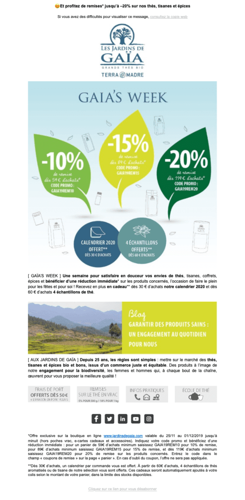
Firstly, the text in the images if in terms of deliverability it has no real impact, it has two negative impacts. First, as mentioned earlier, the image is simply resized in its mobile version, which has the effect of making the text not very readable because too small on a laptop screen. Then, often, the images are hidden by default. With text in the images, you force the user to an additional action to display your content (one click to display the images).
Second, the hierarchy of information The titles would benefit from a graphic layout and, above all, increase the size of the texts. These are to be 12px only1px more than the legal mentions. This makes the reading less fluid and, again, makes the text very small on mobile.
Thirdly, the general design is extremely simple, even simplistic. If the design of the website is uncluttered, it has a very present graphics, with very light green borders, watermarks in some places, etc.. In short, a set of graphic elements that, while being light, give character to the brand, which is unfortunately absent from the newsletter.

So, badsender or not?
Well, here, I would say that it is rather a goodsender. The technical implementation, although perfectible, is good. The same is true for the rendering, the email does not offer an identical and impeccable rendering in all email clients, but it remains perfectly readable.
The problem is in the ergonomics. This one is largely perfectible and would gain a lot in clarity and design if we spent a little time on it.
So overall, this is a slightly above average email.

Don't hesitate to give us your opinion in the comments!
Identity card
Generic email information:
- Subject of the email Take the time to treat yourself!
- From : Aude - Les Jardins de Gaïa
- Preheader : And enjoy discounts* up to -20% on our teas, herbal teas and spices
- Sending platform : Unknown
Checklist :
