Dark fashion and emailing, a bit of history
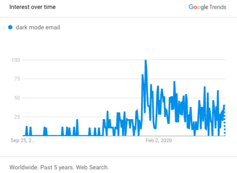
With the release of various dark modes for apps and email service providers since 2018, Dark Mode has undoubtedly been one of the trendiest topics in the world of email marketing in 2020. That's why the Badsender team is working on anticipating the cleanest possible Dark Mode rendering during the HTML email integration phase. And it's still in vogue right now. It has been the subject of more blog posts, conferences, live streams, and webinars than one can imagine. A simple search for the phrase 'dark mode email' on Google returns a whopping 3,170,000,000 results... And this article isn't going to help matters.
It's entirely understandable that this topic is significant: every good email marketer wants their email campaigns to display correctly in the inbox. Indeed, it's probably one of the biggest expectations on their part, and yours! Email development is already a rather complex subject in itself. Especially when we see the number of pages in the Guide on HTML Integration for Email that we wrote. So, the concern grows with the increasing use of Dark Mode. I will try to present you with a condensed history, explanations, advantages, disadvantages, solutions, and conclusions to understand, know, and best manage the display of your emails in "Dark" mode. I warn you, it's going to be hefty, hence the table of contents at the beginning of the article to navigate. Let's begin.
Table of contents
- Dark fashion and emailing, a bit of history
- What is Dark Mode ?
- "In the end, Dark Mode isn't something new...
- The benefits of Dark mode
- Dark Mode issues in email
- Proof by example
- Solutions
- Some good practices to improve the Dark Mode in emails
- Yes or no: is Dark Mode worth the effort?
- How can I detect or know who is checking my emails with the Dark Mode activated?
- Case studies
- Conclusion on dark mode
- Sources
What is Dark Mode ?
Dark Mode is not exclusive to email. Dark Mode, also known as Dark Theme, Black Mode, or Night Mode, is a setting that users can enable so that the text of an operating system or application displays on a dark background instead of its usual light background. This means that instead of the default dark text displayed on a light screen, called Light Mode in contrast, light-colored text is presented on a dark screen.
Dark mode is an accessibility setting that shifts the color palette of the interface to display content in high contrast using dark background colors and a light foreground. Ultimately, it minimizes blue light and enhances readability to reduce eye strain.
Emailonacid
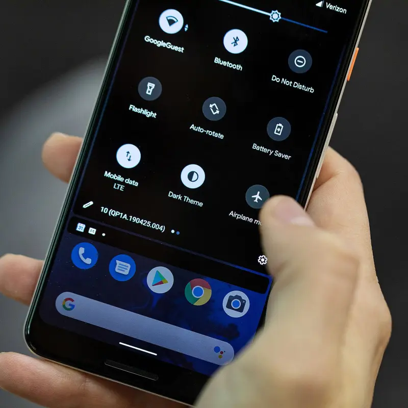
It is therefore a display setting. For example, you can go into the display settings of your smartphone to activate dark mode.
Some websites or applications, and now some email clients, have a 'dark mode' feature.
A small question that can be raised regarding the nomenclature: Is 'Mode Sombre' (Dark Mode) and 'Thème Sombre' (Dark Theme) the same thing? Dark Mode is generally applied to a device (smartphone, PC...), whereas Dark Theme is applied to a specific application (like the specific dark theme for Gmail, for instance). To be clear: just because you activate Dark Mode on your Android phone doesn't mean that the Facebook or Twitter app on your phone will display with a dark background. On the Facebook app, you would need to activate the Dark Mode to get the desired display. On the other hand, Instagram will automatically switch to Dark Mode when you set your phone to dark mode. And for Gmail, you'll need to go into the settings...
It's also important not to confuse dark mode with color inversion. The purpose of Dark Mode is not to systematically and thoughtlessly reverse colors, but to provide a background that's dark with light-colored textual content.
Light Mode or Clear Mode is still, for the time being, the default setting for most phones and applications.
"In the end, Dark Mode isn't something new...
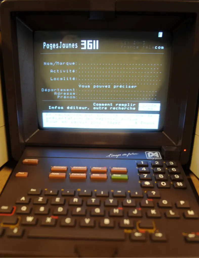
Let's recall: Dark Mode has actually been around for a long time, though not necessarily under this name: the Minitel, for example, displayed texts in cyan or yellow on a black background, which seemed optimal in terms of readability. The same goes for Teletext or Ceefax. Video games and consoles too, for that matter! Atari, to name just one. Even development software like Sublime Text, for instance, offers an interface automatically configured with a dark background and clear code for better code visualization and syntax highlighting.
Computer screens also originally used what we call dark mode today, due to the capabilities of the cathode-ray tubes used at the time. The opposite color scheme, a light-on-dark color scheme, was originally introduced in WYSIWYG word processing software to simulate ink on paper, and thus it became the standard. Indeed, in order to encourage people who weren't programmers to use computers, interfaces were progressively adapted to resemble paper. That is, black text on white paper. There you have it, now you know everything!
The benefits of Dark mode
- It's better for low light settings: you can use it in bed without disturbing your partner, or in the cinema without bothering others, and that's cooooooool.
- Reduces the light emitted by device screens while maintaining the minimum color contrast ratios required for readability.
- Designed to make reading content on a screen in a dark environment easier, for example at night, in the dark (subject to debate).
- Can appear more visually appealing and more pleasant for the eyes.
- Uses less blue light: visual health is better preserved, thus helping to improve sleep quality and causing less eye strain.
- Reduces energy consumption because displaying white at full brightness uses more energy than black, for example. This could therefore have a positive impact on battery life (subject to debate).
- Can potentially reduce eye fatigue and dryness in low light conditions.
- Allows for better accessibility conditions: the high color contrasts and reduced brightness of Dark Mode are generally considered more readable for people with visual impairments like light sensitivity...
- Less brightness means a less shiny screen. Less shiny, less battery used. So less battery to produce and especially to recharge. Overall, we consume less energy.

Is everyone in agreement?
Many of these advantages are still "debated" by industry experts and are sometimes subject to numerous conflicting viewpoints and evidence. However, when we look at all these advantages, we can understand why more and more users (in the absence of precise statistics, we can at least rely on the enthusiasm the topic generates) configure Dark Mode on their viewing screens. And it's precisely this popularity that drives the major email clients to create dark mode settings for their users.
Dark Mode issues in email
Not all webmails, apps, services, and email software necessarily provide a dark mode interface. In fact, very few have made this transition since 2018, but they probably represent a large percentage of your consultations:
- Gmail (via a web browser, an Android mobile app, and an iOS mobile app)
- Outlook (via the Outlook.com web browser, the Mac desktop application, the Windows desktop application, the Android mobile app, and the iOS mobile app)
- Apple Mail Platforms (via the Apple Mail desktop application, the iPhone Mail application and the iPad Mail application)
- Yahoo (via a web browser, an Android mobile app, and an iOS mobile app)
However, the real challenge lies in how these email clients handle dark mode and render emails. We can then speak of different levels of support for Dark mode and discern three main levels:
- No color change.
- A partial inversion of colors, which modifies certain colors while leaving others untouched.
- Complete inversion of colors that swaps light and dark backgrounds and texts. This is the worst rendering. Your emails become unreadable.
| Email client | HTML processing in dark mode |
| Apple Mail (MacOS) | No change |
| iPhone/iPad (iOS 13) | No change |
| Hey.com | No change |
| Outlook.com | Partial inversion |
| Outlook 2019 (MacOS) | Partial inversion |
| Outlook 2019 (WinOS) | Reverse completely |
| Outlook application (iOS) | Partial inversion |
| Outlook application (Android) | Partial inversion |
| Gmail application (iOS) | Reverse completely |
| Gmail application (Android) | Partial inversion |
Very quickly, you'll understand, the design of the email can be modified in some email clients. There might be simple changes from light background colors to dark, and dark text colors to light. Or there can be an inversion of colors, even if the background colors are already dark and the texts are light to begin with. If an email isn't visually pleasing to look at in Dark Mode, the recipient may leave the email or, in extreme cases, might mark your email as spam, ruining your deliverability. The main issue is that email software, applications, and operating systems don't have a consistent way of presenting dark mode.
Proof by example
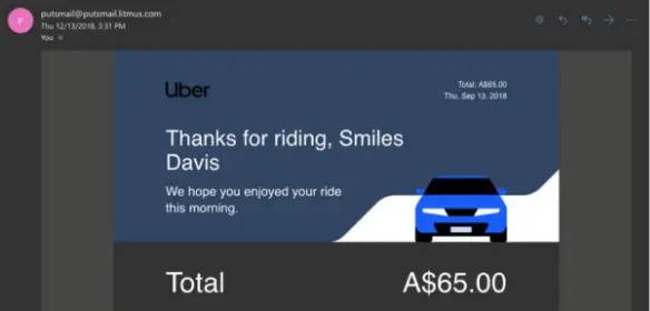
We will now look at four screenshots, one by one, of the same email, opened on different email services. In all cases, this example is based on a rendering on an iPhone with the dark mode activated on the device itself.

- 1st screenshot: Here is the email sent to an Outlook/Hotmail address but opened with Apple Mail: we see that there is no inversion or change of colors: the email displays correctly, in its responsive version.
- 2nd screenshot : Here is a second screenshot : the email is this time sent to a Gmail address, but still opened with Apple Mail : the result is the same as the previous screenshot : the colors are not changed, no problematic change.
- 3rd screenshot : Here is now a third screenshot : This time, the email is opened from the Outlook application, still on iPhone. Here, the rendering is already not the same. The background colors change: the light background color of the header becomes a kind of dark gray: the logo is then not really visible nor readable. Moreover, the colors of the texts below become light on a dark background, but the background color of the cta does not seem to change, nor the elements of the footer.
- 4th screenshot : And finally the most problematic rendering when the email is opened directly on the Gmail application : the colors are also modified, as on the previous capture (you can see that the background color of the cta changes, while the original hexadecimal code is strictly the same) and above all, we can see that elements that are already light on a dark background at the beginning (i.e. the pictos and the logo in the footer) are now with a light background, and are therefore simply unreadable ... There is indeed "color inversion", without even trying to know if the original design is relevant or not (already dark, or not).
First conclusions
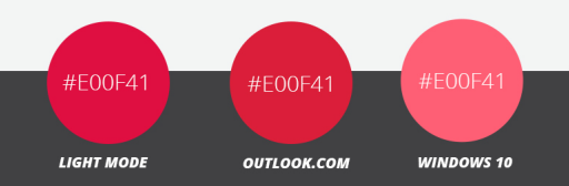
We can see the different levels of support in these examples. Moreover, there is also an inconsistency of color rendering between some email clients: a hexadecimal color code will not display the same color everywhere... This includes all elements where a color is specified via HTML attributes and CSS properties bgcolor, background-color, color, background : That is, mainly text and background colors.
This can lead to a disruption of the brand's identity, loss of reference, bad image of the brand because of a bad user experience. If an email is not "visually" pleasant to look at in Dark Mode, it can harm the user experience, and lead your recipients to leave the email...
So how do you try to ensure that emails are pleasing to the eye despite this Dark Mode? This is a new challenge for email integrators. Here are some concrete solutions in order to manage it as well as possible.
Solutions
The meta tags
If you want to go far enough in working on your emails for Dark Mode, you can already add meta tags in the head of your email to help your email client identify that you support dark and light modes:
<meta name="color-scheme" content="light dark">
<meta name="supported-color-schemes" content="light dark">
Ajoutez aussi un root: dans votre CSS dans la balise <style> présente dans le <head>, de cette façon :
<style type="text/css">
:root {
Color-scheme: light dark;
supported-color-schemes:light dark;
}
</style>
If your recipient has applied the Dark Mode on their email service, these tags will ensure (in principle) activation of the dark mode.
Media queries
Some email clients also support the media query criteria prefers-color-scheme. This criterion was born with the appearance of Dark Mode and is not specific to email. Basically, it allows you to ignore the default color inversions in dark mode and specify your own dark mode theme for your emails. This also usually requires two mock-ups of your email: one version for Light Mode, and another for Dark Mode. This way you will know where to go rather than fumbling around. This criterion is written like this:
@media (prefers-color-scheme:dark) {
/* css spécifique à la version Dark Mode de votre email */
}
This method works in much the same way as applying a style block in a query @media for your Mobile Responsive view, except that this CSS block targets any user interface set to dark mode. @media (préfère-color-scheme: dark) allows you to create the most robust custom dark mode themes where you can implement anything from dark mode specific image swaps, hover effects, background images... pretty much anything you can do with traditional CSS! But like any workaround or solution in email marketing, it is not universal and does not work everywhere. Gmail for example does not support this feature. This feature is mostly available on iOS, Apple Mail and some versions of Outlook.
Play with the [data-ogsc] attribute
This is a method raised by Mark Robbins to target the Outlook application. While this seems to be a fairly narrow market share, it is relatively easy to simply duplicate the styles @media (préfère-color-scheme: dark) that you have already applied and simply add the prefixes [data-ogsc] appropriate to each CSS rule.
For the first and second method, it is necessary to add an important !to your CSS properties so that they take over the rest.
What's next?
There are still other solutions to get around the bad rendering of an email in Dark mode, each one more complex than the other. The blending method for Gmail for example, developed by Rémi Parmentier. Or play with gradient gradients in CSS as proposed by Annett Forcier (who created its own emailing agency, emailboutique.io) . But all this requires a lot of time... And the time to spend is to be estimated with good knowledge of certain data.
Some good practices to improve the Dark Mode in emails
- Use of Transparent PNGs for non-rectangular images so that there are no unsightly white backgrounds and the background color is a solid CSS color.
- Do not use no transparent gifs it is rare that gifs are "totally" transparent: on the edges, there is always a small dirty gradient (especially when it comes to images that are not square).
- Use high-contrast text and background colors so that even with partial and complete color reversal, your message is still readable.
- Apply borders or shadows on the pngs so that they remain readable whatever the background color: for example, if a dark logo is planned on a white background in light mode, it is very likely that this same logo will appear on a dark background in Dark mode: the images do not change automatically... This border or shadow must be of the same color as the background color in light mode.

- Be careful when using background images with HTML text on top: the background image will not change in Dark Mode, but it is likely that the color of your text will change. So make sure that your text, if the colors are reversed or changed, remains readable above the background image.
- If you choose to put text on an image, avoid using pure white (#ffffff) or pure black (#000000). These are likely to be exchanged for other colors when dark mode is activated. On the test palettes, we can thus realize that pure white will be replaced by a dark gray, while a less pure white will not always be "reversed".
- Try changing your cell background, email body, or table background to black without changing the content colors to see what it might look like on Dark Mode in some cases.
- The color in the images is not changed, only the colors in the CSS. We could therefore tend to go for an easy solution and use many more images in the email. Don't go for this solution!
- Avoid mixing images and background colors: the color of the image will not be modified, when the background color designed in CSS will be. Think about a button with rounded corners: if you design your rounded corners in image, be careful about the rendering on Dark Mode!
- Always try to design as much text as possible in HTML to allow the colors to change if necessary, or to modify them if you wish.
- Separate textual and visual content.
- The simplest designs are sometimes the best.
- Test, test, test!
Yes or no: is Dark Mode worth the effort?
Already, it is very risky to see only through the prism of the "yes" or "no". Everything is not black and white, so to speak. There are several levels of consideration of the Dark Mode and several possible solutions, as we have just seen. In any case, you need to establish at least the minimum level of consideration, namely the few good practices seen above.
The excuse of gracious degradation
We could also talk about acceptable degradation in terms of rendering on Dark Mode. Acceptable degradation is, in short, the principle according to which, as long as the email remains readable in terms of its content and the structure does not change radically, then everything is fine. But acceptable degradation should not be used as an excuse, it is not synonymous with "je-m-en-foutisme. And it does not exempt you in any case from testing to know the rendering of your campaigns when the Dark Mode is activated. Email preview platforms like EmailonAcid or Litmus will allow you to obtain an email rendering on this type of configuration.
Get to know your audience
Second, you also need to get to know your audience so you can best decide what level of support to implement. If you know your audience and have numbers on how many of your recipients are using dark mode, it's a great opportunity to start a discussion about the level of support.
Don't forget that 2% on a database of one million recipients still represents 20,000 subscribers. So it is not just 10 recipients that could be ignored! Consider well your percentage of consultation in Dark Mode according to the total volume of your Base.
Finally, you should still know that three of the largest email service providers have announced the arrival or coming of a specific dark mode since 2019: Apple, Outlook and Gmail. This can be a strong argument to at least understand that Dark Mode can definitely not be put aside completely.
How can I detect or know who is checking my emails with the Dark Mode activated?
It is highly likely that a significant portion of your customers already prefer and use the dark mode. But for now, this is just an easy guess. For Dark Mode, you can use, besides guessing, deduction, numbers, and technique!
Deduction
Users can use the dark mode only at a certain time and for a certain period of time. And this is possible both on Desktop and Mobile. You can automatically switch from light to dark mode at 9pm for example, when your environment automatically becomes darker. You can also take this information into account depending on the time you shoot your campaigns. Or according to the opening time of your campaigns.
It is possible to know the consultation habits of your recipient on the consultation of your website if it exists: in principle, you should be able to recover the percentage of Internet users accessing your site with the Dark mode activated. You can therefore deduce potentially a choice as to the level of support you will need to put in place in your campaigns.
The numbers
There are also polls on the subject: regular polls in the #emailgeeks community show that about 20% of people use the Dark mode.
Surveys of marketers show that 59% test their emails in dark mode. And 20% moreover planned to start testing dark email in the near future. If marketers are crescendoing towards testing dark mode campaigns, we can deduce that the number of recipients viewing their emails in dark mode is also crescendoing.
The technique
Try to know the opening environments of your recipientsYou will be able to find out which care methods will be supported or not, and thus make the right choice! You can ask the question directly when you subscribe to your newsletter. Or through a questionnaire on social networks. Or via a specific email campaign...
Finally, a technical solution that I will share with you today, and which comes from Jay Oramemailing integrator at Action RocketThis consists in setting up a background image that will be called only if the Dark Mode is activated with the media query prefers-color-scheme for example. With this image tracked, it is then possible to recover the percentage of consultation on Dark Mode.
Hey - no secret! Happy to share! Basically if you use
background-image: url( tracking-pixel.gif )in theheadthe image is only downloaded when needed, where as all other images in thebodywill be downloaded as soon as the email is openned. So - if you put a background image in theprefers-color-schememedia query or with[data-ogsb]tag - it will only load for a dark mode user.Jay Oram
Case studies
I would now like to read you a passage from an article about the difficulty of coding an emailarticle written by Stoil Stoychev, emailing integrator. As he imagines a fictional discussion between a web developer (that is to say, himself a week before coding an email) and an email guru (him one week later)he comes to address the issue of rendering images ...
- If an image loads in an email, it will usually look as expected. Unless, of course, the dark mode is enabled...
- Do the images change when displayed in dark mode?
- No. But everything else changes. A dark font on a light background becomes a light font on a dark background, etc. Images remain unchanged, but may look "weird" in the new color scheme.
- It looks great! Can I force my email to always display in clear mode?
- No.
- But still, the Mail application on my Mac is set to dark mode and still displays my test emails in the original color palette!
- The Mail client on Apple devices usually retains the original color scheme if the email contains images. But other clients will always impose the dark mode colors.
- Can I detect if the client is set to dark mode?
- Yes, you can use the CSS media functionprefers-color-scheme.
- Let me guess: it is not universally supported?
- Yes, it is.
- Is anything else supported? Can I use CSS?
- Of course you can use CSS! Just make sure you check individually for support for each CSS property you will use.
- OK. Back to the image: how can I make it work in light and dark mode?
- Just come up with a design in which the images look "good" in both light and dark modes.
- And this design should also look good if the images are completely blocked?
- Exactly! You begin to understand! Stoil Stoychev
This discussion perfectly illustrates the complexity not only of coding emails, but especially of taking into account the Dark Mode in email marketing. It's a subject made of "it depends", subject to multiple conditions. A real knotty bag, a puzzle, that every email integrator encounters daily.
Conclusion on dark mode
The Dark Mode, whether it is email or not, is a choice made by the user. So by your recipient. He configures his screen consultation parameters. It is not a default setting, or an innate configuration of the machine. It is a user's choice and it is important to understand this. And it is therefore necessary to know how to respect its choice. If a recipient decides to block all the images in an email when he receives it, we can't go against his will and want to display the images at all costs... The example is pushed to the extreme, but that's the state of mind: we can't go against the recipient's choice, which may expose him to rendering problems.
Should we therefore try to counteract the rendering of an email on this configuration? Should we improve the numerous bugs that the Dark Mode in emailing can cause? Can this be part of graceful degradation or acceptable degradationin the same way as rounded corners are not displayed on some versions of Outlook for example?
Moreover, we know that HTML email integration is already a challenge in itself, subject to multiple constraints of interpretation of tags, HTML attributes and CSS properties. Should we therefore add to the email integrator's work the resolution of bugs on Dark Mode, when he must already manage the multiple issues of Outlookof the 120DPI, accessibility in emails and production times are getting tighter and tighter?
It's an open and rhetorical question, which I'll leave you to think about... In any case, looking for pixel-perfect rendering is a utopia in the email marketing world.
And the Dark Mode in email, on the long term, what does it give?
The Dark Mode is not only a fashion effect. It's a trend that promises to last. And it is not specific to emailing!
It is also important to understand that The Dark Mode is not specific to the emailing integrator. Or to the Designer. They are both the guarantors. And I think that many of you will feel directly concerned. If you need help with this delicate subject, we are here!
Sources
- ActionRocket's Guide to Dark Mode https://static1.squarespace.com/static/5ebbcdaa835ee2443b5cdd82 /t/5ffd789d65dbec6f09a78a09/1610447008189/AR-darkmode.pdf
- Action Rocket: "Dark Mode Support: Is it Worth it? https://www.actionrocket.co/email-design-review/dark-mode-support-is-it-worth-it
- Action Rocket: "Dark Mode: Designer Considerations https://www.actionrocket.co/email-design-review/darkmode-design-considerations
- Dark Mode on Wikipedia: https://en.wikipedia.org/wiki/Light-on-dark_color_scheme
- Brad Forst : "dark mode" vs "inverted https://s.muz.li/NzBlMjFkODY1
- Rémi Parmentier: "Dealing with Outlook.coms Dark Mode " https://www.hteumeuleu.com/2019/dealing-with-outlook-com-s-dark-mode/
- Rémi Parmentier : "Fixing Gmail's dark mode issues with CSS Blend Modes https://www.hteumeuleu.com/2021/fixing-gmail-dark-mode-css-blend-modes/ and its French version https://emails.hteumeuleu.fr/2021/04/resoudre-problemes-dark-mode-gmail-css/
- Dark Mode on Gmail https://github.com/hteumeuleu/email-bugs/issues/68
- Litmus: "The Ultimate Guide to Dark Mode for Email Marketers https://www.litmus.com/blog/the-ultimate-guide-to-dark-mode-for-email-marketers/
- Litmus: "Introducing the Dark Mode Toolkit https://www.litmus.com/blog/introducing-the-dark-mode-toolkit/
- "Live coding an email with Jason Rodriguez - Part III: Dark Mode Support" https://www.youtube.com/watch?v=ErIb8ax1SVc
- "Dark Mode Support" by Jason Rodriguez https://litmus.com/community/snippets/233-dark-mode-support
- "Full Dark Mode Email Template http://go.litmus.com/ODY0LVZQWi0xMzEAAAGAVcM3q-9zi91nuqd31sguHZKP1BXVnUOM9kMBm_xw-Ymkp1tqbW32n0pxwv5K_0O8mAPhz3A=
- "New in Litmus: Extended Dark Mode Testing https://www.litmus.com/blog/new-in-litmus-extended-dark-mode-testing/
- "Dark Mode Email Testing: How it Helps and Why it Matters" https://www.emailonacid.com/blog/article/email-development/dark-mode-email-testing/
- Dark Theme by Material Design https://material.io/design/color/dark-theme.html
- https://www.forbes.com/uk/advisor/mobile-phones/what-is-dark-mode-and-should-you-be-using-it/
- Dark Mode and Emailing https://www.eficiens.com/dark-mode-email/
- Dark Mode for Email : What it is and How to Cope https://www.emailonacid.com/blog/article/email-development/dark-mode-for-email/
- Dark mode in HTML email https://sidemail.io/articles/dark-mode-in-html-email/
- Designing an Email for Dark Mode: Dark and Light Optimization https://www.campaignmonitor.com/blog/email-marketing/2019/10/designing-an-email-for-dark-mode-dark-and-light-optimization/
- Dark Mode in Email - Solutions for Beginners https://taxiforemail.com/blog/dark-mode-in-email-easy-solutions/
- Dark Mode in Email http://www.emaildesignreview.com/email-code/dark-mode-in-email-4814/
- Darktober in Review: Recapping our Dark Mode Email Exploration https://www.emailonacid.com/blog/article/email-development/darktober-dark-mode-recap/
- Survey: what do marketers think about dark mode for emails? https://fr.mailjet.com/blog/news/enquete-defi-mode-sombre/
- Dolist: "Dark Mode and emailing: between real opportunities and pitfalls https://www.dolist.com/blog/conception-design-email/expert-studio-dark-mode/
- How to fix Outlook Dark Mode problems : https://webdesign.tutsplus.com/tutorials/how-to-fix-outlook-dark-mode-problems-cms-37718
- Shining the light on HTML Emails Dark modes : https://noti.st/hteumeuleu/QhIGkB/shining-the-light-on-html-emails-dark-modes
