As you probably know, except for a few masochists, the HTML integrators hate working on email. Where in the last few years the "classic" web has made huge progress in standardization, where most web browsers are starting to react in the same way, email remains their bête noire.
Why? Because if web browsers are generally updated quickly enough (this is less true in the enterprise where there are still a lot of old versions of Internet Explorer), in the world of email we are dragging around balls that are sometimes well over 10 years old.
This is the case of the good old Outlook, which since the 2007 version has regressed to use the HTML rendering engine of the Office suite (an aberration), it is the case of Lotus Notes which persists in some companies with versions that are sometimes 15 years old (but it is now on the way to disappear), it is also the case of some webmails that have strange behaviorsbecause they are archaic or for security reasons. For example, Gmail blocks most of the CSS placed in the HTML header. And many other webmails that change more or less randomly the HTML code of your emails... To adapt it to their sauce.
While for the classic web you have to take into account 4 or 5 browsers with for each of them between 2 and 4 versions, when you test your emails, it is not uncommon that you have to do it in about thirty different environments.
The dictatorship of the tables... and the responsive.
One of the biggest irritations your HTML integrator when doing email. Any placement of the different contents goes through the use of tables!
The formatting via DIVs and CSS rules is excluded in the email world. If he wants his email to be displayed correctly in 90% email clients, he will have to use tables in his HTML code. A technique banned from the classic web for over 10 years.
But for the past few years, HTML integration for email has also had to take into account mobile usage. Since Apple introduced the iPhone, it is possible to send a email in HTML format in the pockets of millions of people. But you don't use email the same way on a 4-inch screen as on a 12- or 27-inch screen. So you have to adapt the display when possible. Again, on the classic web, with a little expertise, it's a very simple operation to perform. But in the world of email, when you have to make an email compatible with the latest iPhone and at the same time with email clients that are almost 15 years old, with tables and taking into account the specificities of each... Good luck! And yes, this is also the constraints of email design!
The email designer can facilitate the work of the HTML integrator: what you need to know about the constraints of email design!
In order to facilitate the work ofHTML integration of the email that a designer is designing, there are a few rules to follow. While these may be perceived as constraints of email design, try to see them as a creative challenge!
1. The width cannot be greater than 600px.
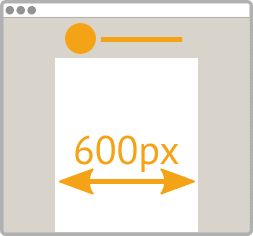
This is one of the constraints of email design. For desktop devices, this is a convention that has existed for a long time. And it still makes sense today. Even though some people use huge screens, the email preview areas are often surrounded by other tools like the email list, the folder list, ... which considerably reduces the available space in width. If you don't want your integrator to have to rectify this afterwards, you should think about this during the design.
2. Plan in your email design what is outside the boundaries of your email.
This is mainly a remark for designers who are used to working with paper. When you create a brochure, you don't have to worry about what's around it since it's ... air! With email (as with the web if you work in fixed size), when your window is more than 600 pixels wide, there will be empty space around your design. In order not to leave your HTML integrator in the lurch, it is essential to include this space in the design you are going to deliver.
3. There should be no obligation to "slice" the images.
A few years ago, when switching from email design to HTML integration, we didn't hesitate to cut out the images in the middle. This allowed to put different links on different areas of an image for example. But with the emergence of mobile email and responsive, it's no longer allowed to think that way. And this is one of the biggest constraints of email design. When switching to a smaller screen size, the different slices can create undesirable effects such as small white margins between images, line breaks of half of them, etc...
4. Do not place large text over a background image, texture or gradient.
If some email clients support background images very wellUnfortunately, this is not the case for all environments. And in order not to force your HTML integrator to use many tricks that will make the correct display of your email more and more random, it is simply recommended to do without texts that should appear above an image... And yes, that's also the constraints of email design! There is an alternative: integrate the text directly into the image... But this text will not be visible when images are blocked by the email client.
5. Use "standard" fonts: Arial, Helvetica, Georgia, Times...
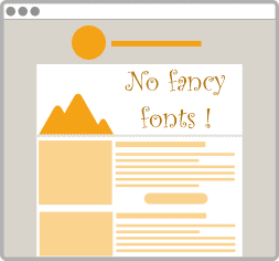
For several years, on the "classic" web, it has been possible to use a font that is not present on the reader's computer or terminal. It is via CSS that it is possible to fetch a font from a remote server. Unfortunately, most email clients do not allow this functionality. So you will have to limit yourself to the fonts universally installed on all computers. If you really want to use a special font, you can always embed it in an image. But as we saw in the previous point, this is not recommended.
6. Think "mobile first".
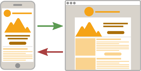
You need to design an email? Start by designing the mobile version before the desktop version! This will allow you to have a more minimalist approach of your email, to go to the essential in the different elements you have to put in place and there is less risk that between the two versions there are differences such that the HTML integration would become a headache.
7. In response, from left to right will become from top to bottom!
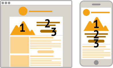
In fact, the title of this section is not quite correct. In real life, you can do everything. But unfortunately, it increases the HTML integration time and the need for template maintenance. The "natural" method when you want to make responsive email is to take the side that a maximum of elements must go from a left to right logic to a top to bottom logic. Don't forget that some elements can disappear or appear on one screen size or the other. But again, the risks of compatibility increase accordingly.
8. Pay attention to the ratio of your images.
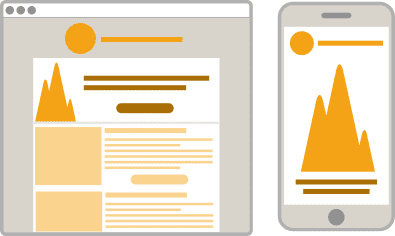
Unless you systematically plan different images for the mobile and desktop versions of your emails, you should keep in mind that the ratio of your images between the two versions will remain the same. What does this mean? It means that a very narrow image, taller than it is wide, once it goes to the mobile version, alone on its line, could well take up all the space on the screen. Conversely, a banner that takes up the entire width of the desktop email, once on mobile will become an insignificant image because of its tiny height. The square has a bright future ahead of it!
9. Think in rectangles.
When you're a designer, you like to have fun, you like to break the mold, and that's great! Unfortunately, the life of the email integrator being made of tables with hopelessly rectangular cells. Creativity can therefore quickly be nipped in the bud. This is the case, for example, with any text that should follow an oblique or curved path. This is simply impossible to achieve! The only solution will be to integrate the whole thing in a big image... Far from the good practices of html integration for email!
10. Think about displaying your email design without an image.
This is one of the plagues of email: most webmails and email clients do not display images by default for security reasons (and originally to save some bandwidth). When we know that the attention time given to a commercial email when it is opened is extremely reduced... It is therefore essential to optimize this display without images so that the email remains understandable and actionable.
11. Reduce the number of columns to a minimum.
It is becoming rare today to find oneself facing emails built entirely on a columnar model. But please, if you are tempted, stop! It's a heart attack for your HTML integrator (even if he'll do everything he can to make it work). Moreover, when using responsive integration, there is a high risk that the elements located at the top of your second and third column (which are therefore visible on the desktop version) will end up at the bottom of your email. Finally, from an efficiency point of view for your subscribers, we have already seen better (do the test if you have some time).
Need help with email design?
You may not know it, but in addition to being a blog, Badsender is also a agency specialized in email marketing. In this context, we offer services ofhtml integration for email and email design. And we know very well the constraints of email design, yes yes!

4 réponses
Very relevant article!
Some additional tips here:
http://www.pole-emailing.fr/outils-conseils/creer-une-newsletter-recommandation-graphique.php
The ideal is to have the email designer and the html integrator in one person...and I know what I am talking about 😉
Michel > It depends, we could even do an article on the subject 🙂 Or better, a battle of articles, you do an article for on your blog, and I answer not an article against 😀
Hi Jonathan! Thanks for the white paper on bad sender. Can you update this article? The constraints are more the same as in 2015. I'd like to have your opinion on message blocks. And SEO? Two different topics.
Thank you